Microsoft Excel 2007: Create a Scatter Plot

Written by:  • Edited by: Rebecca Scudder
Updated May 19, 2011
• Related Guides: Microsoft | Text Box | Excel

In this guide, we’ll show how you can use the chart features of Microsoft Excel 2007 to create a scatter plot. Once you have your data entered, the rest is easy!

What is a Scatter Plot?

A scatter plot is a type of graph commonly used to represent the correlation between two different variables. For instance, it’s generally believed that the amount of time spent studying for an exam has a direct influence on how well a student will perform on that exam. To support this theory, you may gather information from several students consisting of the number of hours they spent studying and their final test scores. This information could then be transformed into a scatter plot.

Sample Scatterplot in Excel
click to enlarge
There are several different types of scatter plots that can be created in Microsoft Excel 2007, but we’ll focus on the most common variety – a scatter plot with only markers – in these instructions. However, these steps can easily be adapted and used to create any of the other varieties of scatter plots in Excel.

How to Make a Scatter Plot

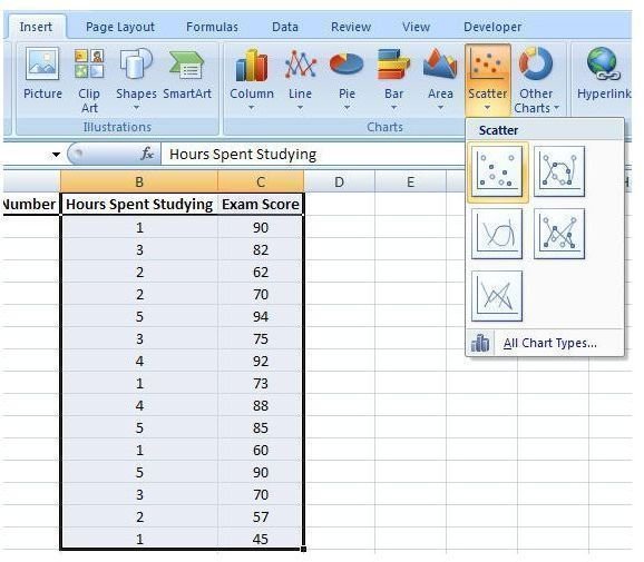
Step 1: Enter or copy/paste your data into an Excel worksheet. As an example in this tutorial, we’ll be using data consisting of hours spent studying and final exam scores for a select group of students. (Click any image for a larger view.)

Sample Data
click to enlarge

Step 2: Highlight the columns that contain the data you want to represent in the scatter plot. In this example, those columns are Hours Spent Studying and Exam Score.

Highlight Columns
click to enlarge

Step 3: Open the Insert tab on the Excel ribbon. Click on Scatter in the Charts section to expand the chart options box. Select the first item, Scatter with only Markers, from this box.

Select Scatter Plot
click to enlarge

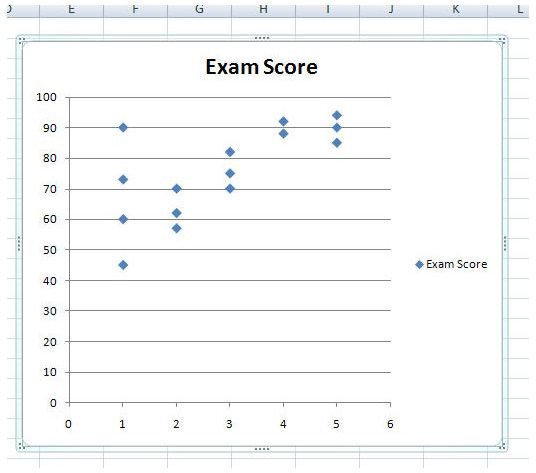
After making this selection, the initial scatter plot will be created in the same worksheet. You can resize this chart window and drag it to any other part of the worksheet. If you want to move the chart to a new worksheet, click here for instructions.

Initial Scatter Plot
click to enlarge

Step 4: Make any formatting or design changes you wish in the Design, Layout, and Format tabs located under Chart Tools on the Excel ribbon. Most of these changes will be based on your own personal preferences, but there are a couple that we’ll discuss here.

Label the Axes

First, let’s label the horizontal axis. To do this, select the Layout tab under Chart Tools. Next, click on Axis Titles in the Labels section. Choose Primary Horizontal Axis and then pick Title Below Axis.

Label Horizontal Axis
click to enlarge

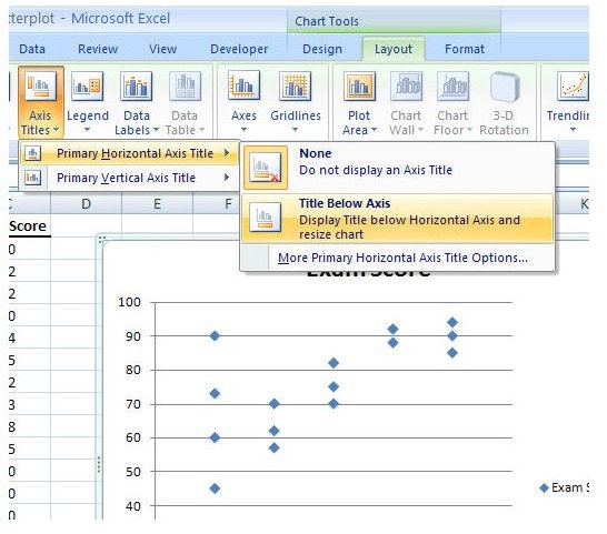
A text box with the default wording Axis Title will appear on the chart. Click anywhere in that text box and edit the information to reflect the true title of the horizontal axis.

Type in Label Name
click to enlarge

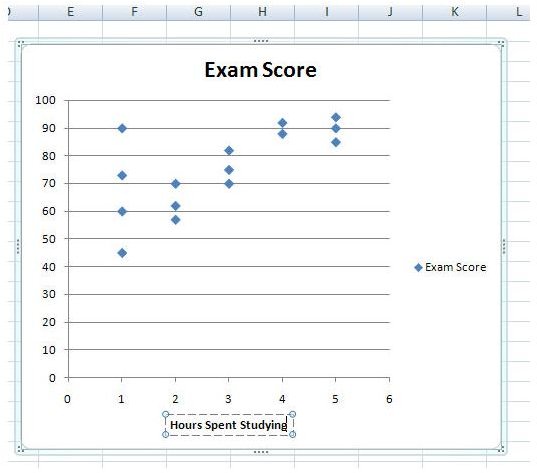
Similarly, you can create a label for the vertical axis, but you will have more choices for title placement here. We’ll use the Rotated Title option.
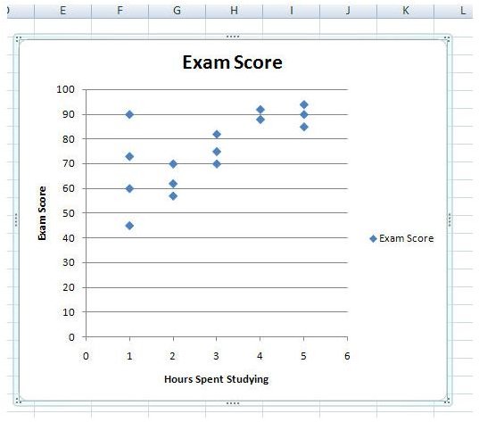
Label Vertical Axis
click to enlarge
Chart Legend

The default legend that was created with the scatter plot serves no real purpose here, so let’s get rid of it. If you’ve been “tabbing” around, go back to the Layout tab and click on Legend. From the list of expanded options, pick None to turn off the legend.

Turn off Legend
click to enlarge

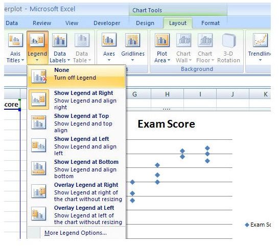
With that annoying, useless little box gone, your chart should now look like the one in the screenshot below.

Goodbye Legend
click to enlarge

Change Chart Title

Another thing that most everyone will want to change is the chart title for the scatter plot. To do this, just click on the title to open the text box that contains it and edit it with your new description.

Change Chart Title
click to enlarge

Visual Appearance of the Chart

If you want to add a bit more color and style to your scatter plot, check out the options available in the Design tab under Chart Tools. There are tons of choices that you can make here to liven up your chart’s appearance. Try a few of them out and see how well you like them. The screenshot below shows just one example of how the scatter plot can be redesigned with just a couple of clicks.

Final Scatter Plot
click to enlarge

Be sure to browse through the other articles on charts and graphs in Bright Hub's library of Excel tutorials. More are being added on a regular basis so check back often!


Comments

Showing all 28 comments
 
RheaMan Jan 5, 2012 8:14 PM
RE: Microsoft Excel 2007: Create a Scatter Plot
I make plot.  plot work good.  good job plot man
Anonymous Jun 5, 2011 1:15 AM
So Useful!
I'm in a stats class and didn't have the cable to just connect the calculator to the computer but through this site I was able to just make the plots on excel and was able to put linear and exponential models on them. Thank you so much!
E Hoekzema Feb 2, 2011 8:40 PM
covarian
I am at a loss at how to compute covariance/data analysis for a project . I am in graduate finance class with very little excel experience. Appreciate any help.
Carrie Jan 24, 2011 6:38 PM
Thanks!
Just saved me hours of work for Quantitative Methods. Lovely. I'm going to suggest this site to my classmates.
Colleen Dec 18, 2010 1:46 PM
Scatter Graph with different sized points on the graph
I need to make a scatter graph with age on one axis and "number of skills" on the other axis... so that a cluster of different sized dots will show up at the intersection on the graph. For instance at the intersection of Age50 and 7Skills, the display would be 7 dots of different sizes. Does anyone know how to do that? Or is that not a scatter graph? Is it some other function in Excel or some other program? THANKS for any help or suggestions!!!
makemebad35luver Dec 12, 2010 4:07 PM
Help?
Hi I have a project due in 3 days and I need to use Excel. I'm showing the correlation of the current prices of Nintendo systems over the years. e.g. The NES currently costs $--- now, and the SNES costs $--- now, and so on. How can I get the system name on there on an axis? Not a label, because it would work out as a bar graph or something, but it makes more sense for a scatter plot, and it won't let me put the name in. It only accepts numbers whenever I try to fix it. Help? I know it sounds confusing, but I REALLY need your help. It is due Wednesday during 7th period. <_>
mac Dec 10, 2010 10:10 PM
scatter plot
Know how to make scatter plot problem is i have smokers and nonsmokers. I am plotting their body mass index and resting pulse rate, but can't figure out how to disinguish smokers from nonsmokers. Can anybody help?
Kamlesh kumar vaghela Dec 2, 2010 10:13 PM
Make a scatter plot
I really thank you for this instruction.
caz Nov 22, 2010 10:30 AM
RE: Microsoft Excel 2007: Create a Scatter Plot
thanks
kat Nov 18, 2010 9:49 PM
excel 2007
Thank yaa!!
Andrew Lee Sep 30, 2010 9:00 PM
X Y scatter plot
Can you show me how to plot charts with individual (X,Y) values?
Anonymous Sep 28, 2010 1:35 PM
thank you
this tutorial is so simple it just helped me do an assignement that would have taken me hours to do in a matter of seconds
Anonymous Jun 8, 2010 9:46 PM
Thank you
I appreciate someone posting valuable information that helps others. Thank you for taking the time.
Jack Apr 17, 2010 6:53 AM
Cheers
Saved me so much time on my statistics coursework
Margaret Feb 22, 2010 12:56 PM
RE: Microsoft Excel 2007: Create a Scatter Plot
Thank you SO much! This saved my life the day before a research assignment was due!
RVR Feb 21, 2010 2:48 AM
Thanks!!
Thanks, very helpful.
MK Jan 24, 2010 6:23 PM
:)
THIS WAS A HUGE HELP! THANK YOU!!!
Yolanda Jan 22, 2010 7:05 PM
This is wonderful
You have no idea how much help your article was. Your article has very clear instructions. I just started a grad school level stats class and needless to say, I am overwhelmed. Thank you for shedding some light into this heart wrenching topic.
P.S. I shared your article with my class mates and they were extremely grateful too :o)
Anonymous Jan 20, 2010 5:13 PM
Thanks
AWESOMENESS! thanks, that really helped me with my math class. :)
chi Dec 2, 2009 7:44 AM
RE: Microsoft Excel 2007: Create a Scatter Plot
Than you!!!
It was very helpful to me :)
Thank you very much!
Hippie Nov 30, 2009 3:27 PM
Good
Yeah good tutorial but it left me confused how to get the A1 A2 A3 labeled???
lauradorgan@yahoo.com Nov 23, 2009 9:32 AM
Thank you!!!
So simple! Thank you. It would have taken me forever to figure out!
Frank Oct 30, 2009 6:04 PM
scatterplot
I have large numbers: millions of acres vs years; and the auto scatterplot shows nothing at all and axes with single digit numbers. I had no problems in EXCEL 2001 and 2003. In 2007 everything went crazy
hoyo Oct 4, 2009 8:04 PM
thanks
extremely helpful, i looked everywhere for something like this. thanks
AJ Sep 30, 2009 11:41 AM
You are effing awesome!
This helped so much!
Geraldine S Long Sep 29, 2009 8:03 PM
Scatter plots
Thank you, your information was very helpful
Torii Aug 23, 2009 12:52 PM
NICE XD
Thank you so much for this tutorial! Now I can do my Excel assignment easily =p
Shripad Lale Jun 28, 2009 2:59 AM
How about labels for points
This is good, but I would like to have each point labeled (which could be switch off visually) to indicate to whom it belongs. In your example, if I hover my mouse over a point, I should get its name as A1, A2, A3, etc. Can this be done? I have a feeling that this was possible in earlier Excel version but can't be sure. the problem is, without this feature, if I find a point that is an 'outlier', I need to search its 'ordered pair' value to find out 'who' it is. The name would allow me to pick the point more easily.

Thanks for a great tutorial.
 
blog comments powered by Disqus
Email to a friend