Cooling Off Images While Color Grading in Apple's Color 1.5
The Abstractions of Color Grading
Color grading is an interesting concept as it applies lots of numerical calculations to a field that is essentially subjective and based on perceptions. Much of what color grading is interpreting vague feelings about the colors of a particular clip and then shifting them in a direction according to abstract direction. Much of what people refer to is the “temperature” of the video clips they are seeing, which does not refer to the actual temperature in the same way a Tungsten balance does. Instead this refers to how hot or cold the scenario does based on the color schematic that is used. To adequately color correct the image you must go in the direction that either you, or the client, are asking based on these abstractions. One of the most common color grading requests is to cool off an image, which is fairly easy to do in adequate color grading program’s like Apple Color. Here is a basic Color Tutorial on how to cool off your video images while color grading.
Cool Off Images
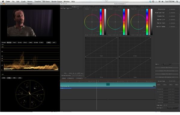
Once all of your important clips are listed in the Shots tab of the larger Setup tab you can make sure that you have one selected and in the Timeline for alteration. Here is where you actually make all of your creative decisions in Color and if you have come straight over from Final Cut Pro it is likely that all of your video clips are going to be in the same order as they were in that project. Select your clip and go to Primary In, which is the tab to the right of Set Up. You main goal here is to use color to cool off images, which means head them into the direction of blue. This does not mean that you are going to create an inherently blue sensibility to the images, but to just cool off those images by keeping toward that direction. For example, if you have a great amount of red and orange in a video clip already then that clip is going to appear warm. To counteract that you will go into its exact opposite direction: blue. The image will lose some of its red and yellow, but may not incur any blue. If you do add blue, however, this will dramatically cool off the image. Start by going to shadow and affecting the color in favor of blue. This is a good place to start, but you may end up not including any blue tint from the Shadow or Lift areas. Take a close look at the images and try different areas, including Midtone and Highlight, to cool off the image. For example, if there is more red and yellow in the Highlights then this is going to be a good place to go. You essentially have to work with it until you find the general color that you like.
Color Complexity
It is not always simple enough to use Color 1.5 to just cool off images as it can create problems in the image. Images can shift and have unintended color results, such as two colors mixing and creating an artificial look. You may have to shift away from the blue tint in certain areas and go from another direction. You may also have to end up raising the contrast by crushing the blacks and bringing up the Highlights if the cooling off of the images causes a fog. All of these simply require a close look to make sure that you are not creating issues in the image quality. For a basic cooling off of the image you can do this all in Primary In, but if you want to do more focused and specialized control and cooling then you can move over to Secondary In.