Understanding the Pantone Matching System
Before the Pantone Color Matching System was developed, there was no standardized way of matching colors in graphic design industries. These industries require a precise way of identifying and matching colors to achieve a standard and accurate color system for their range of products. The system was introduced in the 60’s and ever since, even with new color matching standards popping up, this system from Pantone has remained the most popular and widely used color matching system in the world.
What is the Pantone System?
The system simply assigns identification numbers to individual colors to make them easily distinguishable from each other. This number system is what helps graphic artists, printers and companies keep track and identify exactly what color they want to use for a project. With professionals using the Pantone color chart for reference, printing colors across all kinds of businesses and industries produces the exact same color; making it easier for companies and individuals communicate color better, faster and easier.
How People Use the Pantone System
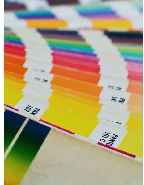
The Pantone colors are available for viewing in a variety of ways. They usually come in swatch books that are composed of color strips. These strips contain sample prints of colors and they are arranged in such a way that lets people easily view the colors. Binders are also another format for the color system. Some binders feature pages that can be easily torn off, so designers will have an easier way for showing their clients the kind of color they are using for their projects.
Different types of paper are also used to show people what a color will look like in different printing settings. Coated, uncoated and matte paper types are often used in one strip or page for a single color to show people that the same color can have a different look and feel if printed on different kinds of paper. The colors themselves can be formulated in different ways to keep the same look and quality across different types of paper.
Updates
For a half a century, the Pantone Matching System has been the standard for color matching in the world and it is recognized as the most relevant. It has maintained this kind of relevance thanks to constant updates and improvements to the system, such as additional colors and keeping up with the trends such as the current digital age.
Issues with the Matching System of Pantone
The quality and the efficiency of color identification itself is not a problem with the Pantone Matching System. However, a lot of people are using the system through digital means. In other words, they are viewing Pantone colors with their computers. The issue with this is that different computer monitors provide different qualities of colors, so they are usually not the same shade as they are in real life. Viewing Pantone colors on computer screens should only be done for preliminary evaluation purposes and colors printed in real life should be reviewed before any decision about colors are made by graphic designers and companies.
References:
Pantone, https://www.pantone.com/pages/pantone/Pantone.aspx?pg=19970&ca=1
D-zignsinc, https://www.d-zignsinc.com/view/pantone.html
Photo Courtesy of Wikimedia Commons / Supplied by Carlos Paes