Enhance the Appearance of Web Pages with Dreamweaver’s Spry Tabbed Panels
Creating Tabbed Panels
Web pages sometimes end up cluttered as developers and designers try to pack more information into the first point of contact with a visitor. One of the Spry widgets in Dreamweaver CS4 creates tabbed panels that open and close as the user browses the page. Start your first tabbed panel by opening a new HTML file in Dreamweaver. As with all Spry widgets, save the page under a new name before creating a widget. If you do not, the software will just prompt you to do so when you try to insert the widgets.
Begin this process by putting the cursor on the new page where you want the panels to appear. Click “Insert,” “Spry,” and “Spry Tabbed Panels.” A tabbed panel with two tabs will appear. The panel and tabs are outlined in blue. Click in the “Content” panel that appears under the first tab. Insert some trial (random text in this example) or actual text intended for the live Web page. The content can include both text and images. The tabs may link to other URLs. Now repeat the same action, first clicking on the Tab 2 panel and then inserting more text in that content section. This simple process is the essence of creating tabbed panels. Next, you will need to enhance these panels to improve the looks or create more panel depth. First, though, check how your work looks at this point by clicking on “File,” “Preview in Browser” and select a browser. Depending on your browser security settings you may have allow the browser to run ActiveX or scripts.
Spiffing Up the Panels
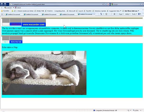
The first edit to make to the panels is to change from the default tab names to something meaningful. For example, typical menu choices on a commercial home page include items such as “Home,” “Contact Us,” “About Us,” and “News.” Additional tabs and panels may be added, but for now, just change the Tab 1 and Tab 2labels to “Home” and “Contact Us.” Do this by clicking on the tab itself and typing the new names.
Next, make some changes to the properties of the tabs by clicking on “Window,” “CSS” and expanding the “SpryTabbedPanels.css” section. In the “.TabbedPanelsTab” change the font-weight to bold to make the letters stand out more. Change the background color of the “.TabbedPanelsTabSelected” to a different color so it is clear to the user which panel is active. Customize the background color of the content tab by selecting “.TabbedPanelsContentGroup” in the CSS style section. When you edit these features, pay attention to how the text appears.
Customize other parts of the tabs and content by experimenting with the rest of the SpryTabbedPanels CSS styles. This can become a bit cumbersome since border changes must be made individually on the top, bottom, left and right. In addition, never lose sight of the principles of good Web design by overcomplicating the customization. Change panels from horizontal to vertical by editing another style in the Spry css file.
Adding Additional Tabs and Content
Add more tabs to the current panel by right clicking on the “SpryTabbedPanels: TabbedPanel1 at the top of the page. In the properties inspector, click the “+” sign next to “Panels,” This creates a new tab, which you can rename as outlined above. To delete the new tab just use the “-“sign in the same spot. To add more entire panels, follow the process of inserting Spry Tabbed panels wherever you like on the page.
Be sure to upload not only your new page but all of the files, both CSS and JS in the Spry Assets folder.