Using Sparklines in Excel 2013: A Tutorial
The Basics of Sparklines
Sparklines use two sets of data – typically you want to visualize your data over a period of time. Thus one set of data will typically be time related – month, day, quarter, etc. The other set of data will be whatever you want to track – prices, quantities, etc. Since Sparklines are small and fit right next to your data, you can have one or more per row of data.
Sparklines can be customized in a number of ways. You can start with one of three main designs – Line, Bar or “Win\Loss”. The line and bar charts are self-explanatory and are used for positive numbers. If you are charting percentages over a period of time where you may run into negative numbers, the Win\Loss Sparkline may be a good fit as you can easily see where any of your numbers went negative.
Creating Your First Sparkline
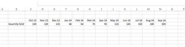
I’ve set up a simple set of data with one row indicating one month per column over the course of a year. In the second row I have ‘Quantities sold’. Just looking at the numbers it’s hard to pick out any trends over the twelve month period (Figure 1).
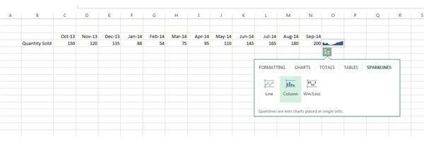
To create a Sparkline, select your set of data and right below your selection you will see a small icon pop up – this is called the Quick Analysis tool. Click on it and select Sparklines. Choose the Line or Bar chart and you’ll see a small chart appear in the cell to the right of your selection (Figure 2).
Customizing Your Sparkline
Once you click on your Sparkline, the Sparkline Tools tab will open up on the menu ribbon. The ribbon is comprised of five main sections – Data, Type, Show, Style and Group (Figure 3).
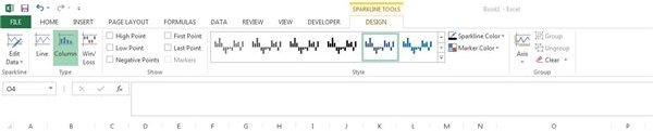
- The Edit Data button will let you edit which data is used to build your Sparkline.
- The Type section lets you select your Sparkline and easily convert it to a different type of chart.
- The Show section allows you to easily highlight certain data points such as the high or low values.
- Style lets you change the color scheme for your Sparkline charts.
- The Group section allows you to group multiple Sparklines so any formatting you apply to one chart will apply to others.
Getting Fancy
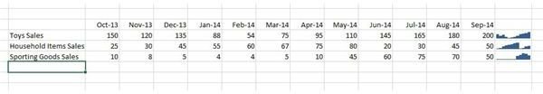
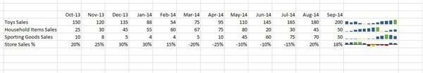
Now that we have the basics down, let’s toss in some more data and spruce up the Sparklines a bit. I’ve added in a few more rows of data. The first row still shows our months over the course of a year. Rows 2-4 are sales numbers from three different departments. The last row will be an overall percentage for the store we’re using in our scenario. I’ve added basic Sparklines to each row but it could still use some pizazz (Figure 4)!
The first thing we’ll do is to make the Sparkline larger by expanding the column that the chart resides in. I will also group each of the Sparklines so any formatting and styles I apply will apply to all four charts. Simply select all the charts and click the Group button on the Sparklines tab.
I also want to highlight the high, low and negative points so once again I select the grouping of charts and click the High, Low and Negative point buttons. By default all three points will be the same color so I select the charts and use the Marker Color button to specify green for the high point, yellow for the low point and red for negative points.
As you can see in Figure 5 the end result can easily convey information to any viewer. They can easily see the trends for each category of sales without the need to dig into the numbers. The best thing is that Sparklines are part of the cell so they can be printed out or saved to PDF along with the rest of the data.
Don’t be afraid to toy around with the various options – do your audience a favor and include some Sparkline to liven things up in your next Spreadsheet!