Introduction to Some Practical Methods for Biostatistics Using MS Excel
Overview
Biostatistical data tend to be overwhelming, due to their immense size. However, if they are processed with some statistical methods, some useful information (that is, more manageable information) can be derived from them. You may want to think of this work as a summary of the original data. The summary may not reflect all the details that the original dataset has, but it can capture its most important aspects and give you a good idea of what your measurements mean.
Statistics is not all about numbers, though. Some interesting plots can be derived as well. They are particularly useful if you plan to share the statistical analysis with other people, possibly through a slideshow presentation. These graphs can be very intuitive and something your audience is bound to appreciate and understand, while the statistical number may require some interpretation from your part.
The statistics that will be shown in this brief introduction to the topic are: mean (average), median, standard deviation, a type of distribution plot, and confidence interval. They are selected because they are something that the majority of your audience can understand, even if they haven’t progressed to a college degree. Also, the methods can provide you with enough insight for your analysis and can be a solid basis for your interpretation of your dataset. Microsoft Excel, although not a statistics program, can help you in all of that, and you won’t need to do any programming since it has plenty of premade functions for this field.
Some Useful Methods for Biostatistics
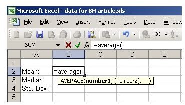
The first thing you can do with your data is something simple and somewhat useful: Find its center point. This is usually represented by two statistics: mean (average value) and median. The first is calculated in Excel with the function AVERAGE (see figure below).
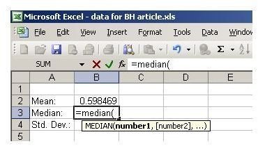
The median is a bit more complicated, at least in real life, but in Excel it is just another simple function with the same name (see figure below).
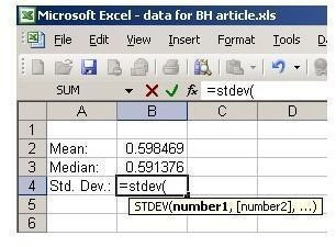
Another useful statistical metric is standard deviation, which is a measure of dispersity. In other words, it shows how spread out your data are. It is calculated with a quite complicated formula, but in Excel it is just a simple function: STDEVA or STDEV (see figure below). STDEV assumes that your data are all the data available, while STDEVA assumes that you are using merely a sample of the available data.
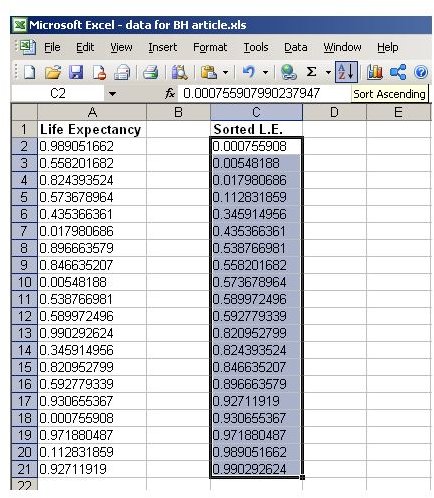
To gain an insight on how the data are distributed, you can create a plot. Before doing that though, you will need to rearrange the data a bit–in this case sort them in ascending order (see figure below).
Afterwards, simply select all the data and click on the chart button. You may choose to tweak the chart next according to your preferences. In the end, it should look something like the one in the figure below.
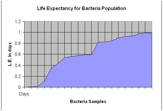
What this plot shows is how the data are distributed. In this example, the plot’s shape shows that the distribution is more or less linear.
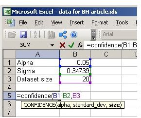
A final method that is quite useful is that of the confidence interval. Given a confidence level (let’s call it alpha) we can estimate an interval within the dataset’s range where a data point is more likely to fall. The alpha is usually a small number (0.05 or 0.01) showing the chance of error (which is why it is set to be relatively small). If it was set to 0, the confidence interval would comprise the whole dataset. If it was set to 1, it would be reduced to a single point, the mean. You can find the confidence interval quite easily using the Excel formula CONFIDENCE (see figure below).
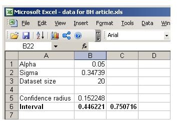
Once you calculate this, the confidence interval would be the range between (mean - confidence) and (mean + confidence). This becomes clearer in the figure below.
Going Beyond MS Excel
As MS Excel is quite generic as an application, it is recommended that you look into some alternative programs that specialize in this sort of function. If you want to go into depth in Statistics, SPSS and Statistica are good programs to use. They both have a very similar look and feel to Excel, so it isn’t too hard to learn them. If you are interested in something even more advanced, MATLAB is a good alternative. This program has a whole toolbox for Statistics and allows you to create your own programs (or adapt existing ones), to make the most of your data.
Whatever program you use, the concepts described in this article are exactly the same. If you learn them well, they can be a solid basis for all your statistical endeavors, regardless of the program you employ.
References
All the material of this article (including the images) are based on the author’s experience.