Lear the Importance of x-Height in Typography
x-Height Basics
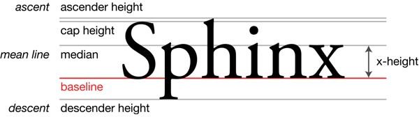
The concept of x-height in typography categorizes font types by the size of the lower case letter “x.” the distance between the bottom
of the “x” (the baseline) and the top of the “x” (mean line). Ascenders, parts of other letters that rise above the mean; and descenders, parts of letters that go below the baseline are not included in the x-height calculations. Also, note that lowercase letters that are rounded at the top may “overshoot” the mean line, extending slightly above it.
Letters such as u, v, w, and z usually are equal to the x-height of a typeface, although the modern array of typefaces that abound in our day sometimes provide exceptions to that rule.
Image Credit: Wikimedia Commons/Max Naylor
The Significance of x-Height
Your typography can make the difference between a successful project and a failure: x-height is an essential part of that. Typefaces with a large x-height in relation to total height has the effect of having less white space between lines of text. Similarly, fonts with larger x-height seem to appear darker and more crowded, potentially resulting in problems with readability. On the other hand, type with smaller x-height values tend to make the ascenders and descenders more visible, often making reading it easier on the eyes.
The same size of different typefaces often appear to be different because of x-height: Type with large x-height values tend to appear larger, thus providing a more modern feel. The larger representation of lowercase letters can make them easier to distinguish, leading to improved readability, although many people believe that large x-height type can make it difficult to read over extended periods, much after the way text with all capital letters becomes tedious over time.
CSS makes use of x-height, although different Web browsers may interpret the value differently, making it somewhat unreliable for type definition.
Addressing x-Height Issues
X-height is a key concept of typography, but applying it can be challenging. You can usually mitigate the effects of large x-height values by increasing the spacing between lines (leading) and by using paragraph alignment styles other than fully justified. The benefits of various x-height values can be manipulated for creative use and effect. For example, brief messages can be emphasized by using type with large x-height, while the use of smaller x-height may be preferable for use in long text compositions.
In CSS, the use of “em” rather than “ex” can provide for a more consistent rendering of type across different browser platforms.
People offering different perspectives on the effects and applications of x-height may never completely win their arguments. Instead, desktop publishers and other creative workers should seek new ways to leverage the use of the concept of x-height in typography