Treasure maps can be a fun activity for both adult and child parties, romantic game, or teaching a child directional skills and map reading. Whatever the reason this article details a simple and fast way to make your own treasure maps using Photoshop.
Making a Treasure Map In Photoshop
If you’re like me you probably enjoyed making and following treasure maps as a kid and still do! Treasure maps are great for parties or just an activity to get your family out of the house. Luckily it’s easier than ever to make a treasure map using Photoshop than ever. This tutorial uses Photoshop CS4 , but any version of Photoshop from CS1 or higher will work just fine.
The methods used in this article to make a treasure map require pretty basic to intermediate Photoshop skills and should only require a brief understanding of the program to create a successful map. However you might want to familiarize yourself with loading brush packs and layer control or at least be ready to learn along the way.
Also, you may want to download some free pirate clipart images before you get started—these graphics will make great additions to your final treasure map.
Step 1
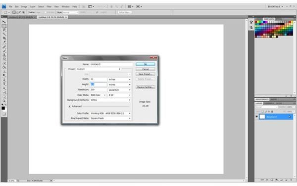
Create a new document that is 11 in. by 8.5 in. or by using the ‘Presets’ drop-down menu and selecting ‘U.S. Paper’. For demonstration purposes I am using a landscape canvas but feel free to use a portrait layout if it suits your treasure map better.
Step 2
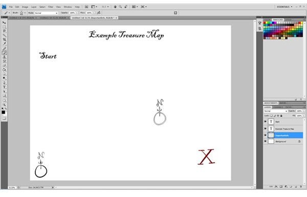
Create a new layer to contain the elements of the map that don’t need to be moved much. Things such as the title, compass rose, instructions, map key, and both starting and ending positions are all things that will not need to be moved.
Step 3
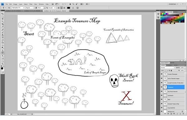
Add another layer for your landmarks. These landmarks will determine the directions that your map reader must follow so make sure you lay them out as accurately as possible so that they are not lost or confused. Optionally, you can choose to label your landmarks with text as I have done here.
Step 4
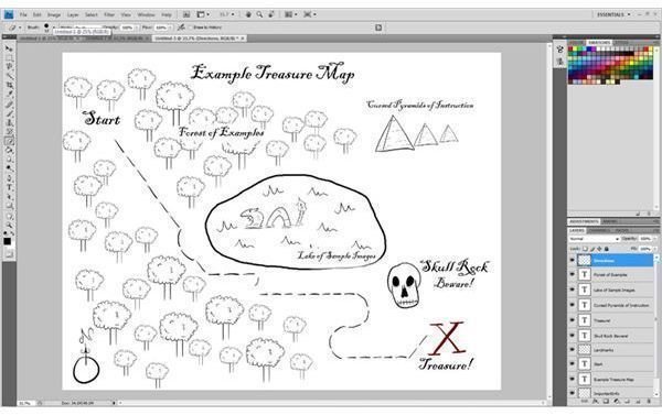
Create your directional layer which will plot out the path that your readers must follow in order to get from point A to point B. Make sure that the lines do not intersect with anything to avoid confusion. If something is in the way either delete it, move it, or just work around it by creating a small detour for your reader to follow.
Step 5
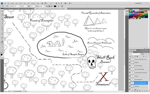
Add a few finishing touches where you see fit. This could include things like: detours, warnings, additional symbols, or labels. Get creative!
Step 6
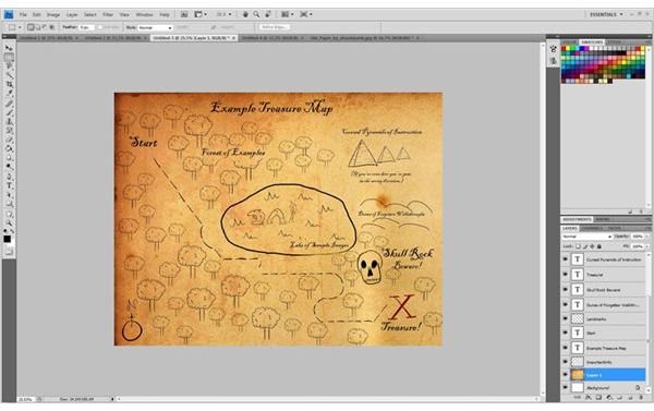
If you want to take your map a step further and give it a very old and traditional look, find an old paper texture and copy and paste it into a new layer. Using the free transform tool stretch the image or size it down to completely cover your page. Don’t worry if it goes over the edges of your canvas. Hit the Enter key to save your Free Transform and place the layer at the very bottom of your map.
Step 7
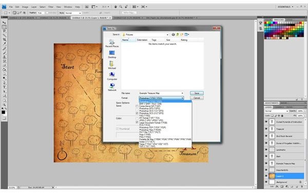
Save the map file as a .psd in case you need to make changes later on. If you are completely finished with your map use the Save As… tool to save the map in .jpg or .png format depending on your preference and your map is ready for printing.
Additional Tips
Get creative! Treasure maps are meant to be fun so dress things up to fit with your treasure hunt theme. A playground sandbox can become a wide, foreboding desert or a
Use colors any colors you think fit to your map’s theme. Traditionally maps were inked with dark inks like black, blue, red, or green inks and any combination of them, but if you are making a cuter treasure map use lighter colors. Make sure that your map is readable with the colors you use.
If you chose to use an old paper texture and feel like it’s too dark and obscuring important information, you can adjust the opacity settings of the layer to lighten it up some and give a more subtle worn look.
If your landmarks aren’t easily recognizable it might be a good idea to make each dash represent a unit of measurement and place the unit converter somewhere easily found like near the compass rose or at the top or bottom the screen.. (i.e. 1 dash = 5 Paces)
If you cannot avoid placing your labels over a picture and it becomes hard to read, place your landmark layer at the bottom and carefully erase around the text until it becomes legible.
Credits
All of the map graphics used in this guide were created by me and are available in Photoshop brush pack form here .
The old paper texture was created by struckdumb whose work can be found here .
The font used in this article is Blackadder ITC which is available by default in Photoshop CS4.


