Want to get the word out about the fall festival at your school, the latest game, debate club meeting, or other special events? Here are three simple tips to help you create a great, eye-catching flyer for your school event in minutes, using any basic desktop publishing program.
School Event Flyers Made Easy
Using any basic desktop publishing program or even a program like Microsoft Word, you can create a flyer that gets noticed . Just follow the tips in this quick and simple guide to help you make a great-looking, eye-catching flyer to announce your upcoming event. If you are just starting and need some more help, read about how to find and download free flyer templates that you can use for your school event.
Layout
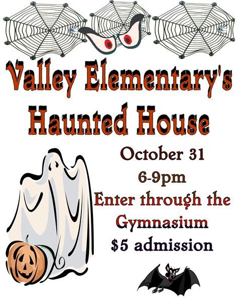
The most important thing about your school event flyer, is the event. So the title of your event should be the most prominent thing on the page, generally towards the top.
Next, you have the vital information that people need to know including date, time, location, and cost, if there is any involved. This should be located somewhere beneath the event title. In the example below, I have placed that information in the lower right hand corner; however, the lower left corner or centered on the page would also work as long as it is highly visible and easy to read.
Using bold fonts works best, but do not be afraid to get a littler creative as long as the content is still easy to read at a glance.
Graphics
You should use simple graphics that can visually depict the theme of your event right away. In the example below, I placed some spider webs and spooky eyes at the top above the event title, with a ghost predominately displayed below it so that, even at just a glance, you get the idea that there is some sort of a spooky or Halloween related event that the flyer is telling you about. You can use clip art or even insert photos of previous events, your school, team, etc.
Borders can work in place of main graphics when you have a lot of information that you need to convey. With a related border, such as falling leaves for a fall festival, or pom poms for cheerleader tryouts you can still convey a sense of what the event is while allowing room for the extra information that you may need to include.
Be careful not to over clutter the flyer. Using too many graphics will make your flyer appear jumbled and the information that people need to know will get lost. At the same time; however, be careful that you do not have too many large blank spaces because then there is nothing to draw someone’s attention to your flyer. You can use a small filler, like the bat that I used to close up the empty space at the bottom of the flyer; or you can simply increase the size of the existing content to make everything proportional to the size of the flyer.
Printing
One last thing to keep in mind, you do not always have to print in color to get attention grabbing results. Using dark thick lines in colors that will pop off of colored paper can also give you a great look. This flyer for example, would print well on some Halloween orange paper to give you a bold look that draws your eye towards it.
So remember that information is top priority. Follow that by related graphics in bold colors or printed on paper that is suitable for the event and you will have a great school event flyer in minutes.


