How to Handle Fonts in Scribus
Fonts
When it comes to regular documents and word processing, fonts are generally nothing more than a preference. People choose a font because they like the way it looks, and for the most part, that font gets used throughout the whole document. The only variation comes from throwing in italics, or bold, or in the case of certain scientific or academic documents, a superscript or subscript.
When it comes to desktop publishing, fonts are one of the critical elements of generating a professional looking document. For some documents, a regular font used throughout is the norm. For other documents, using fonts in this way leads to a document that looks like it was “printed on a computer.” The latter complaint is what usually leads people to the world of desktop publishing.
To understand fonts, it is first necessary to know how they exist on the computer. Microsoft Windows, Mac, and even most Unix systems come with some fonts built in. Those fonts can usually be used in any program more advanced than a simple text editor. However, these fonts are not the only fonts that exist, and in many cases can be improved upon depending upon the goal. Since the goal of desktop publishing is to generate a document which can be professionally displayed (in print or elsewhere), it is critical that the fonts are not an afterthought.
Font Substitution
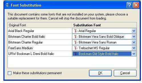
One of the first issues a desktop publisher will need to deal with is fonts that are not available on the system being used. The standard word processing program just takes a font that it determines is “close” or uses the default in its place. With the precise layout we are looking for in desktop publishing, this is an unacceptable solution.
To solve this issue, Scribus offers up a way to substitute fonts that are installed in place of those that are not installed. The user may choose any installed font to stand in for any of the original fonts. The chosen substitute need not match closely or at all if the user plans to significantly re-work the document. Otherwise, the user should either carefully choose close matches, or install the original fonts. Since Scribus is a free open-source program, the fonts that come with it are also free (or those already installed on the system), so it will be up to the user to build up their own library of fonts.
Once the fonts from the document have been mapped, the user is free to change the fonts to fit his or her needs. Unlike a word processor where the user highlights the text, chooses the new font and then clicks OK to see what it looks like, Scribus helps the user see the effect of changes right away so that additional tweaks can be made, if necessary.
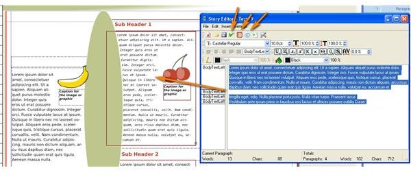
In the picture, the Check Mark icon means “Apply and Exit the Text Editor.” The orange Cancel icon means to cancel any changes that were made in the text editor without applying them to the document. The most powerful button is the white circle with the blue “return” arrow in it. This applies the changes made in the text editor to the document, but DOES NOT save them. Thus, the user can see the font changes without necessitating an UNDO if the effect is not what was hoped for.
Next, we’ll look at some of the additional options available in Scribus for dealing with fonts.
This post is part of the series: How To Use Scribus The Free Desktop Publishing Application
Scribus is a powerful desktop publishing solution. Unlike its very pricey cousins from Adobe and Quark, Scribus is also free. Don’t let its price fool you though. If you know what you are doing, you can do almost anything in Scribus.