MACD stands for Moving Average Convergence Divergence; it has been around for over 40 years now after having been developed by Gerald Appel. It remains a valuable and widely used technical indicator, but, as with any stock analysis tool, MACD must be understood to be applied properly.
Moving Average Convergence Divergence
We covered simpler moving averages and the slightly more complicated exponentially weighted, or just exponential moving averages (EMA) in prior articles. Now we will explore one of the more prominent and long-lasting appilcations of EMAs. The Moving Average Convergence Divergence oscillator, or MACD, has been around for over 40 years and is still one of the more reliable technical analysis indicators.
MACD Explained
MACD, or Moving Average Convergence Divergence readily explains what this indicator is: it shows the convergence or divergence of two different exponential moving averages (EMAs). Actually the EMAs have different intervals. If we remenber the basics of EMAs, the interval is the basis for the coefficient (named “alpha”) used in computing EMA values:
alpha = 2 / (N + 1), where “N” is the number of days in the averaging interval
Shorter (smaller) intervals produce larger “alpha” values, and vice versa. The most common MACD uses 12- and 26-day EMAs, resulting in alpha values of 0.1538 and 0.074, respectively. MACD is the difference from subtracting the 26-day EMA from the 12-day EMA. The shorter 12-day EMA reacts more quickly to price changes than the 26-day EMA; thus MACD is the difference between the faster and the slower EMA. To get each MACD value, subtract the 26-day EMA from the 12-day EMA.
MACD(N) = EMA12(N) - EMA26(N)
The second piece of the MACD indicator is a 9-day EMA of the MACD indicator itself. This produces a smoothed version of the MACD; we know from the prior article on EMAs that this 9-day version is a slower version of the MACD indicator. In fact, in MACD parlance, the 9-day EMA is called the “slow line”, while the MACD indicator is the “fast line”. It is the relative action of these two lines, along with price movements and trends in the underlying security, that produces signals with the potential to foretell upcoming direction in the underlying stock, index, or other investment vehicle such as an ETF (exchange traded fund).
MACD Applied
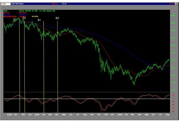
We’ll use the S&P 500 (SPX) index to illustrate. The figure below shows a traditional daily high-low-close price chart (top pane) and MACD (lower pane) for the most recent two years:
The price chart also shows the simple 50-day (red line) and 200-day (blue line) moving averages of the closing daily price. We will talk about these as we discuss the various aspects of MACD. We have also added some markers on the chart that we will discuss shortly.
Understanding and Using MACD continued
First, some general observations. Note that the 50-day simple moving average tracks the overall price action more closely than does the 200-day average, as we would expect. Also note that the MACD lines move between upper and lower extremes, or oscillate. This behavior puts MACD into a group of technical analysis indicators called oscillators. Also note that in most cases MACD doesn’t remain at the extremes for very long; this makes MACD a good predictor of trend or direction change; when MACD is at the top end of its range, there will most likely be a change in direction; one can expect the same when MACD is at the bottom of its range.
Now let’s look at some of the buy and sell signals that MACD generates. Notice the two vertical lines on the upper price chart labeled “S1” and “S2”. “S1”, on October 15, 2007, marks where the MACD fast line first crosses below the slow line. On that day, the SPX closed at 1548.71. Such occurrences as “S1” are not outright “sell” signals because they occur quite frequently and therefore are not the most reliable. They serve better as pre-signals or warnings that the prevailing up trend may be coming to an end. “S2”, on November 5, marks where the MACD line crosses from above zero to below zero. The white horizontal line in the lower MACD chart marks the zero line. This is an outright MACD sell signal that likely indicates that the previous up trend is over and the next significant move should be to the downside. On that date, the SPX closed at 1502.17. We see that the SPX continued lower into January 2008.
It was on January 30, 2008, that the MACD fast line crossed above the slow line, generating the “B1” signal (analogous to the “S1” signal that we just discussed above). As for “S1”, this is not an outright buy signal, but a pre-signal that may be warning that the present downtrend may be completing. On this date, SPX closed at 1355.81. SPX rallied from this low until making a similar low in late March. On April 2, 2008, the MACD fast line crossed through zero, generating the outright “B2” buy signal and confirming that the previous downtrend had completed; the SPX closed at 1367.53.
If you would have “sold” the SPX when the “S2” signal occurred on November 5, 2007, and then closed that position when the “B2” signal occurred on April 2, 2008, you would have captured a 134.64 point, or an 8.96%, move. You could have closed the position on the earlier “B1” signal (on January 30), for a 148.86 point, or 9.74% move. However, since the “B1” signal is not the most reliable, you would have had the risk that the SPX could have continued even lower before generating the ultimate “B2” zero-crossing.