A Preview of Zune HD - Apple iPod Competition
Still Holding On
When the first Zune was released in 2006, it was obvious that Microsoft was playing catch-up. It was also obvious that while the Zune has some limited benefits over Apple’s iPods, it simply lacked the style of Apple’s thin, sexy products. The number of Zunes sold continues to be dwarfed by the iPod, and there is no immediate end in sight.
But if Microsoft has proven anything, its the ability to see the big picture. The company continues to stick its fingers in a great many pies, making continual, incremental improvements at the aims of increasing market dominance. The latest step in Microsoft’s Zune line is the Zune HD, an obvious competitor to the iPod touch which feels unfashionably late to the party. But is the Zune late to the party because it was buying the keg, or because it was having trouble convincing dad to let it borrow the car?
The Sexy
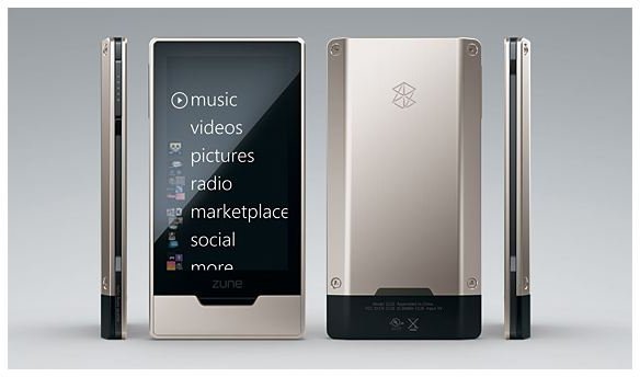
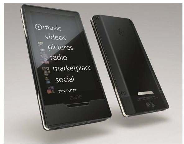
The most immediate and obvious feature of the Zune HD is the touchscreen. Touchscreens are becoming common, but well executed ones are harder to find. The Zune HD looks promising on paper, as its screen is a 3.3" 480x272 OLED multi-touch interface. This is slightly lower in size compared to the iPod Touch, but the quality of the picture should be comparable. The new Zune HD’s interface, unlike the touchscreen interface, uses the traditional Zune main menu consisting of large, easy to see options which span across the screen. This makes more visual sense then the iPod Touch’s smaller buttons, which can become difficult to discern at a glance. On the other hand, it is discouraging that Microsoft seems to have adapted their older interface to the touchscreen interface rather than creating a new interface specifically for the touchscreen device.
Aesthetically, the Zune HD has made great strides against its competitors. In fact, I dare say that the Zune HD appears in some ways sexier than Apple’s product. While the Apple iPod Touch has always appeared quite attractive when viewed from the front, the chrome shell only looks good for a few minutes after the product is opened. Fingerprints and scratches quickly pile up forcing the user to either cover the iPod Touch in a less-then-sexy carrying case or polish it religiously. The Zune HD can be had with a silver or a black finish that appears more industrial and more durable. Microsoft also creates a trim, flattering appearance by more closely matching the size of the screen to the size of the device.
Continue on to the next page to learn about our predictions for the Zune HD.
Video Killed The MP3 Star
While the Zune HD is a looker, the Microsoft brand carries baggage that makes it hard to call the new Zune HD irrefutably beautiful. But the Zune has always impressed with the strength of its cold, hard technical traits, and Microsoft has really pulled out the stops for this new product. While no larger than the iPod Touch, the Zune HD will have many of the same features including Wi-Fi with a web browser, a built-in accelerometer, and Microsoft’s own online store known as the Zune Marketplace. The Zune HD also crams in features not found on the iPod touch such as a HD radio tuner and social functions which have always been exclusive to the Zune products. Compared to the iPod touch, the Zune HD appears capable of standing its ground on this front. In fact, the Zune HD appears to only be disadvantaged in regards to those users who make consistent use of the Apps available to the iPod touch. Those who prefer to use the device as a music player first will probably be better served by the Zune HD.
It is in the arena of video, however, that the Zune HD really lays down its cards. The iPod touch is no slouch in this regard. Its large, bright screen makes it one of the best mobile video players available today. But the Zune HD’s 16:9 screen should be well suited for playing video as well, and the Zune HD’s video is powered by Nvidia’s Tegra system-on-a-chip. As a result of this, the Zune HD is actually capable of playing movies at 720p resolution when the player is connected to an HDTV (using a docking device, which has yet to be seen). That is an impressive feature. The ability to place a movie on the Zune HD and watch it anywhere on the Zune HD or on an HDTV could inspire a portable video revolution. The reinforce this, Microsoft has announced it plans to perform a merger between the Zune Marketplace and the already well established Xbox Live video service. This means that the Zune HD will have a large library of movies and TV shows available for download at release.
Predictions
It seems that the more things change, the more things stay the same. The Zune HD is an exciting product for numerous reasons, but those reasons are essentially the same reasons that a person might be excited about buying any Zune available today. Integrated radio, the Zune marketplace, and the featured social functions of the Zune have always been the product’s advantages, and the Zune HD furthers them in tangible and obvious ways. The new Zune HD will be the best Zune yet, and in turn it will be one of the best mobile music and video players on the market. However, the lack of Apps or any creative new interface features makes it clear that Microsoft continues to play catch-up to Apple.
The video playback ability which gives the Zune HD its name is the real news, and it could be an important addition. The ability to play video has always felt like an after-thought on even the best players, and the Zune HD seems to be trying to a new approach. But there is a catch. The dock which is supposedly needed to play back video at 720p resolutions is still under wraps, and it is unclear when Microsoft plans to show it to the public. The dock could be anything from a tiny adapter to an unwedly plastic landing pad. Until it is unveiled, the revolutionary potential of the Zune HD’s approach to video must be muted by skepticism. This will be a solid product, but it is not a proven game changer. Yet.