Windows 7: Interface Improvements Analysis -- The New Taskbar Design
Introduction
It goes without saying that the troubles and concerns we all had concerning Windows Vista have not gone unnoticed by the media, technology sector (and yes, even Microsoft itself). Heck, even my own godforsaken mother had a few gripes about Vista. Now that Windows 7 has been out for a little over a month, though, it’s time to take a look at the improvements and features in this latest Windows release and see how they stack up against prior releases and the nagging complaints over Vista. Does this upgrade still hold it’s place as a worthwhile switch up from it’s predecessor? To answer that question, I will be taking a look at some of the most prominent features of Windows 7 over the next several days – and the best place to start, in my opinon, is with the new user interface structures.
Please note that this series is not designed to be all-inclusive; for example, I don’t plan on directly analyzing features that don’t have any relevance outside of corporate or other business use due to a personal lack of resources (besides, there are probably a hefty number of resources elsewhere that are dedicated to those features). So don’t expect a whole lot of BitLocker analysis, if there will be any at all. For the most part I will aim primarily for the home user and perhaps look into providing analysis from other sources to fill in the gaps.
Taskbar Improvements
Perhaps the biggest change in Windows 7 coming from Vista – or any other prior Windows version, for that matter – is the slate of changes to the system taskbar. This long-existent task management space has taken on its first major overhaul in its structure and functionality since it’s first appearance way back in Windows 95 (sorry folks, the Windows XP task grouping introduction and other such changes do not count in my book) and it certainly has made a big difference in how Windows is used and configured in regular use. Gone is the clumsy-acting quick launch area; instead, the taskbar itself acts as quick launch on steroids, or so to speak. Case in point: running programs can be pinned in place to access them later if you use them frequently, and dragging a shortcut item from, say, the system desktop has much the same effect in a mannerism similar to that of the MacOS Dock (for the Apple fanatics amongst the crowd). Furthermore, you can even mix and match icons on the taskbar to your preferences so that regardless of when these icons are visible they always show up right where you want them.
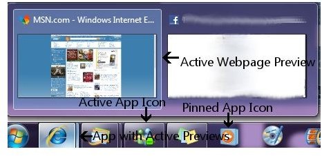
Better yet, the task grouping feature is now enforced across all programs; in other words, rather than wait for the taskbar to get crowded a la Vista and XP, the taskbar now hides open documents and windows – as well as open browser tabs in Internet Explorer – within the confines of a single (rather than multiples of a) document selector. Plus, each document or browser tab has a quick visual preview so you know which one of them has what you’re looking for. Yet when adding this into the mix, when combined with the Mac-like approach to the taskbar itself the whole thing actually manages to beat Apple in the app-switching department! This is perhaps the single biggest improvement of them all compared to everything else.
Verdict: Worth the Upgrade
Jump Lists
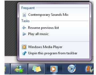
The concept of jump lists in Windows 7 hearkens back to the introduction of task-sensitive pop-up menus in Windows 95, and provides a quick, easy to use approach to loading frequently-used documents, starting a favorite music playlist, quickly connecting to recently-viewed webpages, and so on. To date I have seen and used jump lists for loading favorite games on my Steam account, quickly loaded frequently-accessed websites, started a private internet browsing session or two, and even loaded a favorite music playlist into my favorite media player. As far as my experience goes, this is a definite must-have just because it’s such an effective time-saver. That doesn’t mean there’s a jump list for everything yet as it’s still a new portion of the resources available in Windows 7, but I expect that over time the number of apps that provide one of these suckers will increase, thereby making it easier by the day to load the most frequent of documents, media files and whatever finds itself in my preferences.
Verdict: Worth the Upgrade
Start Menu
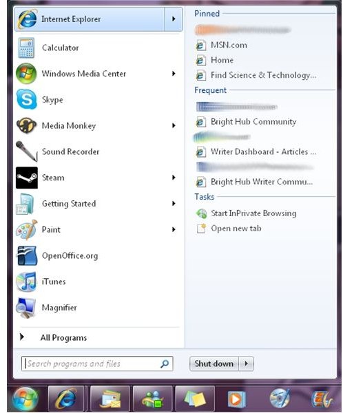
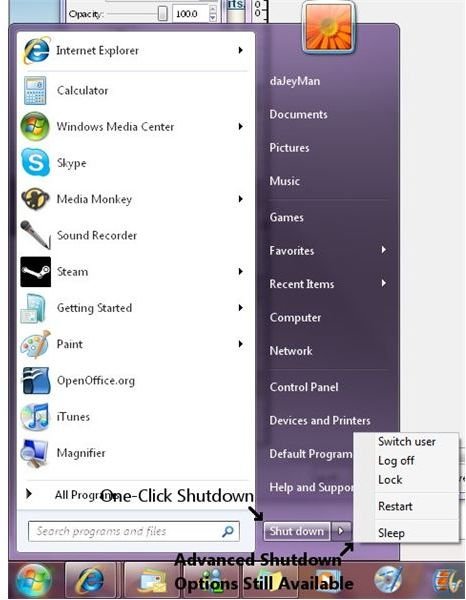
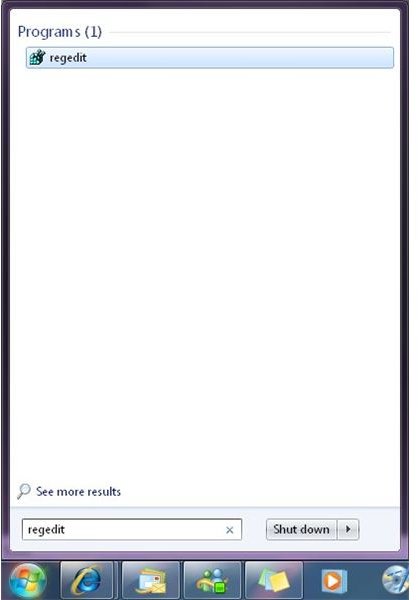
While it’s no longer possible to set your favorite web browser or mailbox program at the top like in prior implementations of the current form of the Windows start menu aside from the still-available menu pinning (which amounts to a small concession in the name of simplification – and perhaps also to legal bigwigs due to the number of antitrust complaints over the years), the design otherwise remains the same (and the style is now enforced for some odd reason, so forget about the old-school implementation going forward since it’s now in the dustbin of history). Yet there are at least a couple of small, incremental changes: items on the start menu that have jump lists display them in the right portion of the menu in a similar vein to Office 2007. Also of note is the change back to a single button for a complete shutdown, though the related pop-out menu remains in place from Vista for requesting sleep mode or a system restart or whatever else you need. On top of that, using the search box now takes over the entire start menu with the results, letting you focus only on what you’re searching for (this is demonstrated in the screenshot using regedit, which is a common search performed when troubleshooting computer issues). While these changes themselves are hardly buzzworthy, they still make the right impact to put these changes in the same camp as the other interface improvements.
Verdict: Worth the Upgrade
Final Analysis
Since that’s effectively three for three – as one might say – it’s evident that the interface improvements in Windows 7 are eons away from anything that existed before in terms of design aesthetics, even between the Windows and MacOS camps (or even Linux, for that matter). These changes within the formulative appearance and use of the Windows desktop and application launching mechanisms are like nighttime ahead of the day compared to recent or past history. If these new features are used even more by the requisite sources (like app developers in regard to jump lists) then there’s no doubt in my mind that Windows will become the easiest computer platform to use (sorry, Mr. Jobs).
In the next part of this series, I intend to go beyond the visual parts of Windows 7 and analyze the interface changes regarding the interactive portions thereof. Until then, be sure to catch up on other Windows 7 topics here at Bright Hub.
Screenshots
This post is part of the series: Windows 7: One Month Later
It’s been just over a month since Windows 7 hit retail, but is it still worth the upgrade? In this series, I look at the individual features headlining Windows 7 and provide analysis on whether these features still provide enough reason to upgrade.