Gantt charts are important to project managers, but often you need some rather complicated programs in order to create them. Learn how to create a Gantt chart in Microsoft Office and Excel.
Access
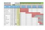
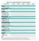
A Gantt chart is a chart the helps project managers with project schedules. Many times you need a project management system like Microsoft Project in order to create these types of charts. However, there are ways that you can create these charts in both Microsoft Access and Excel.
In Access, one way to do this by using a software program by the name of Gantt Chart Builder System . How the Gantt Chart Builder system works is that you can color individual items in a line, allowing you to highlight features that you want to stand out to your audience. You must always have start and end dates in your data for the system to work.
With Gantt Chart Builder System, you can do the following things:
-
Build a chart
Advertisement -
Delete the information on the chart
-
Highlight milestones
Advertisement -
Select how you would like the presentation to display
-
View and/or print your chart
Advertisement -
Export your chart as an image or to an Excel workbook
Before you start working on your chart, you need to figure out how you want your schedule broken down. It needs to be one of the following: yearly, quarterly, monthly or weekly. This will set up how your chart will look in the end.
You should download the free trial of Gantt Chart Builder System before you buy it.
Another way to create a Gantt chart is in Microsoft Excel. If you have this system, this may be the easier way of creating your chart.
Excel
To create a Gantt chart in Excel, follow the below procedures:
-
Open a new worksheet.
Advertisement -
Enter the data that you need in the cells. An example could be the following: Column A: Task, Column B: Start Date, Column C: End Date and Column D: Days Remaining.
-
Select the cells of your data. For the example, this would be cells A through D.
Advertisement
- Select Chart Wizard.
-
Under Chart Type, select Bar -> Stacked Bar.
Advertisement -
Click Next twice.
-
Select Finish.
Advertisement -
Double-click the first series of information. For the example, this would be start date.
-
Go to Patterns -> Format Data Series -> Border: None and Area: None.
Advertisement
-
Select OK.
-
Double-click the vertical axis.
Advertisement -
Go to Scale -> Categories in Reverse order.
-
Check the provided box.
Advertisement -
Double-click the horizontal axis.
-
Go to Scale.
-
Type in these dimensions: Minimum: 36739, Maximum: 37441, Major unit: 61 and Minor unit: 1.
-
Stay in Scale and select Category (X) axis crosses at maximum value.
-
Go to Alignment->Orientation. Type 45 degrees.
-
Right click the legend, and select Format Legend.
-
Go to Placement -> Bottom.
-
In the legend, select Start Date.
-
Press the Delete button.
Your chart should now look like a Gantt Chart.
Related Articles
For more information on Gantt Charts, read the Bright Hub articles What is a Gantt Chart? , Top Ten Benefits of a Gantt Chart and Project 2007: How to Create a Gantt Chart .


