A thermometer chart allows viewers to see how much of a particular goal has been achieved with just a single glance. In this Excel tutorial, we’ll show how to create a thermometer chart that can be used for a variety of purposes.
Using Thermometer Charts
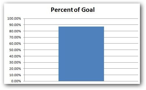
The term “thermometer chart” is a catchy name used to describe a graph that depicts a single rising value. In reality, this type of graph is really just a column chart that only contains one column, which changes in height depending upon how much data has been collected.
For example, a charity organization may have a particular yearly goal that it is trying to achieve in member donations. A thermometer chart can be used to keep track of the donations received throughout the year so that, at any point in time, someone can look at the chart and see what percent of that goal has been met. In fact, we’ll use this very same scenario as an example for describing how to create a thermometer chart in Excel 2007.
Sample Data for Thermometer Chart
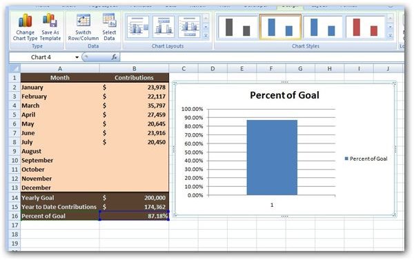
For our example, we’ll use a simple table that has been entered in Excel that includes the charity’s yearly donation goal and fields in which to input each month’s donations in dollars. This table is shown in the screenshot below. (Click any image for a larger view.)
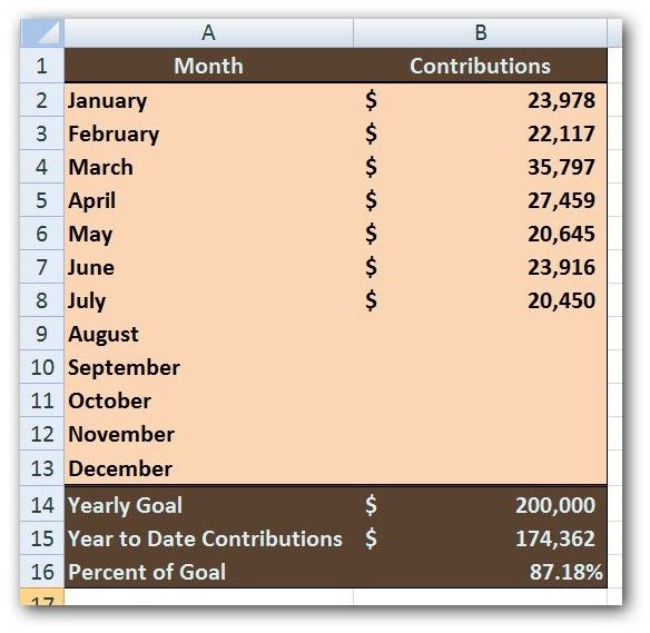
Most of the fields in this table are fixed, but there are a couple that contain formulas – namely cell B15 which contains the Year to Date Contributions in dollars and cell B16 which contains the Percent of Goal. The formula we are using in cell B15 is =SUM(B2:B13) so that all months, January through December, are included in the total, even if no values have been input for the month yet. For the Percent of Goal, in cell B16, we are using the formula =B15/B14 and formatting that result as a percent.
How to Make the Thermometer Chart
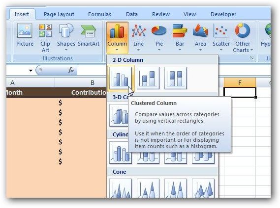
Step 1: To begin, we want to insert a “blank” column chart. We’ll do this by selecting any blank cell in the spreadsheet and opening the Insert tab on the Excel ribbon. Then, in the Charts group on the ribbon, click on Column and choose the first column chart type under 2-D Column.
You should then see a blank chart area in your spreadsheet as in the screenshot below.

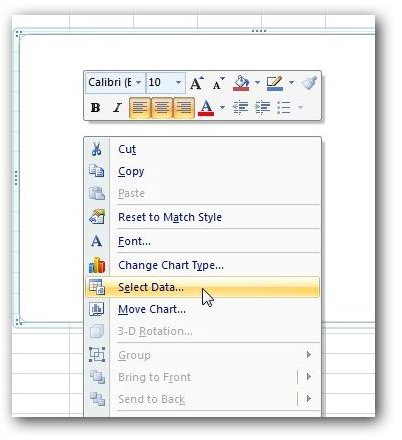
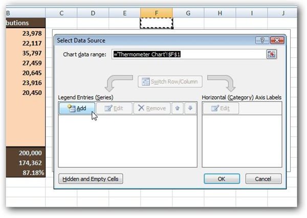
Step 2: Right-click anywhere over the blank chart area and choose Select Data.
This will open up the Select Data Source window shown below. Click on the Add button in the Legend Entries (series) portion of this window.
Now, a new window entitled Edit Series will appear. With the cursor in the field under Series name, click on cell A16 – the cell that contains the text Percent of Goal. Then, tab down to the Series values field and click on cell B16 – the cell that contains the actual percentage value.
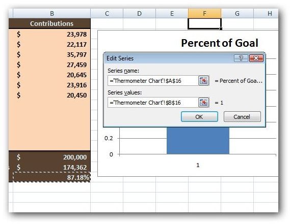
Click OK to return to the Select Data Source window, and then click OK again to go back to your Excel chart. We’ve still got some work to do, but at this point your chart should appear as in the screenshot below.
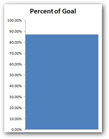
Step 3: The next thing we want to do is get rid of the legend to the right of the chart and the 1 at the bottom of the column that is acting as a horizontal axis label . To do this, right-click on each item individually and select Delete.
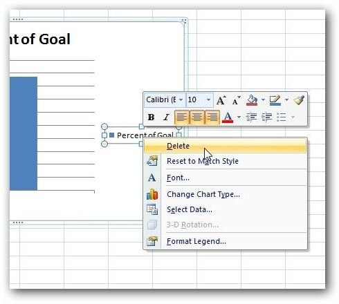
Here’s what our chart looks like now.
Continue on to the next page for the remainder of this tutorial on how to create a thermometer chart in Excel 2007.
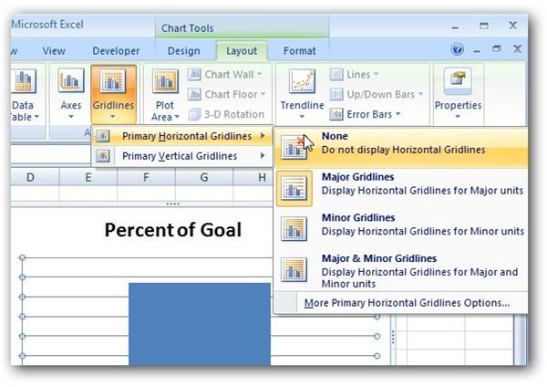
Step 4: Next, we want to get rid of the gridlines on the chart. Make sure that the chart is selected and then navigate to the Layout tab under Chart Tools on the Excel Ribbon. Once there, click on Gridlines, then choose Primary Horizontal Gridlines, and select None.
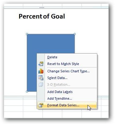
Step 5: Now, we want to modify our single column so that it fills the entire chart. Right-click anywhere over the column and select Format Data Series.
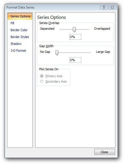
When the Format Data Series window appears on your screen, select Series Options from the list in the left panel. Then, change the values of both the Series Overlap and the Gap Width to 0%.
Click Close to return to the chart in your Excel spreadsheet. After a little resizing, our chart now looks like the screenshot below.
Step 6: We also want to make sure that the percentage values on the vertical axis range from 0% to 100%. In this example, Excel was smart and picked those values by default. However, this might not always be the case! So, if you need to make changes here, follow the instructions in this tutorial on customizing chart axis values .
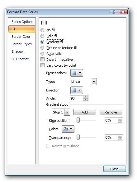
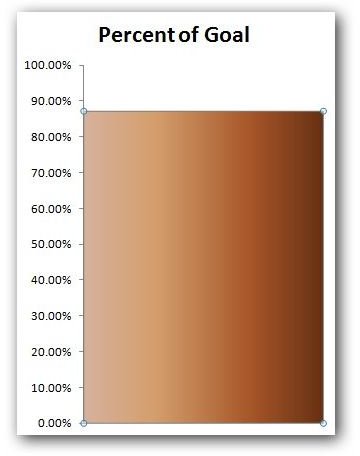
Step 7: We actually have a basic thermometer chart now, but it’s not really that pretty. There are a number of formatting changes you can make to spice it up a bit, but we’ll look at one in particular – changing the fill color of the column. Right-click anywhere on the column in the chart and select Format Data Series again. This time when the Format Data Series window opens, click on Fill from the list on the left.
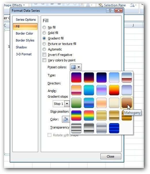
There are several choices we can make here, but we’ll restrict ourselves to applying a Gradient fill. Click on the radio button next to Gradient fill and several more options will become visible.
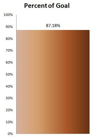
Click on the drop down icon next to Preset colors and you’ll be presented with several gradient patterns. Select any one that you like – for our example, we’ll pick the Mahogany pattern.
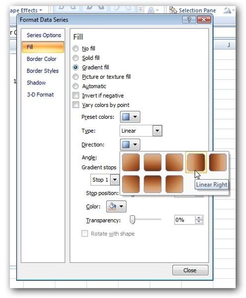
Next, click on the icon next to Direction and select a direction for your pattern. Here, we’ll choose the Linear Right option.
Click the Close button and you’ll be returned to the chart in Excel. Here’s a screenshot of what we have now.
At this point, you can continue making format changes until you obtain a look that you like.
For more tutorials, be sure to take a look at the other Excel chart and graph tips found here on Bright Hub’s Windows Channel. New and updated items are being added all the time, so bookmark us and check back often.


