Microsoft Excel 2007: What is Conditional Formatting?
What is Conditional Formatting?
When analyzing data, it’s important to be able to pick out which information answers certain questions. For example, you may want to know which items represent the upper 10% of a collection or how each item compares to others in the list. By invoking Excel’s conditional formatting feature, you can define your own rules which will apply special formatting to specific cells. This formatting makes it easy to pick out which values satisfy the predetermined conditions used to formulate these rules.
When creating a conditional formatting rule, you can choose to apply it to an entire worksheet, a group of selected cells, a general table, or a pivot table. For each of these options, there are quick formatting shortcuts with predefined rules that can be accessed. However, to get the full power of this feature, you’ll have to bypass this shortcut method and learn how to create and manage your own rules. We will cover both options in later articles of this series.
Different Types of Conditional Formatting in Excel 2007
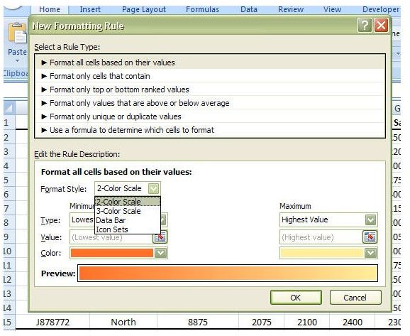
When creating a new formatting rule, several options are available for how you want the formatting to appear. The following list covers the broad categories for these options, but there are also several subcategories within each one.
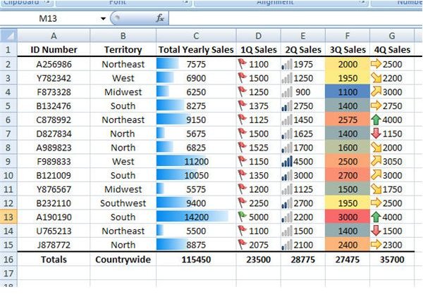
2-Color Scale – This option allows you to pick two colors, assigning one to the highest value in a selection and the other to the lowest. Values that fall within the minimum and maximum will be assigned a color that is somewhere “between” these two original choices.
3-Color Scale – Similar to the 2-Color Scale, this option allows you to pick one additional color that will be associated with the midpoint of your data range.
Data Bar – Rather than alter the color of an entire cell, the Data Bar option can be chosen if you want to show how each particular value in your list compares to the rest of the collection.
Icon Sets – With this tool, you can choose a set of graphics and have your formatting rule apply a different icon to each value in your list based on the group to which the value belongs. For example, you may choose an Icon Set with four images, and break your data up into quarters.
As this series progresses, we will take a more detailed look at each of these options.
How Do You Remove Conditional Formatting?
Although it may seem strange to talk about how to remove conditional formatting before we actually walk through the steps of applying it, this is as good a place as any to bring up the topic. The same technique can be used to get rid of any type of conditional formatting on a worksheet so it applies to the rest of the articles in this series. Also, this technique can be especially helpful if you’ve received an Excel file from another user and hate how it was formatted.
Step 1: If you only want the formatting removed from a certain collection of cells, a table, or a pivot table, select that area on the spreadsheet. Otherwise, if you want the formatting removed from the entire worksheet, don’t worry about selecting anything.
Step 2: From the Home tab on the Excel ribbon, click on the Conditional Formatting icon in the Styles section.
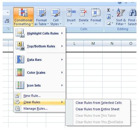
Step 3: Select Clear Rules and then make an additional selection based on which item – spreadsheet, selected cells, table, or pivot table – the conditional formatting should be removed from.
After making this selection, the formatting will disappear. However, you can always use the Undo button to get it back if you’ve found that you made a mistake.
This post is part of the series: Microsoft Excel 2007: Conditional Formatting
This series of articles explores the many different ways that conditional formatting can be used to analyze data in Excel spreadsheets.