How to Create a Brochure with Microsoft Word
Here’s What you Will Need:
- Microsoft Word 2000 or later
- A color printer
- An internet connection to download the templates
Brochures
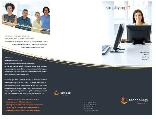
Downloading Brochure Templates
Please refer to the Microsoft Word Templates section of this six-part article series for further information.
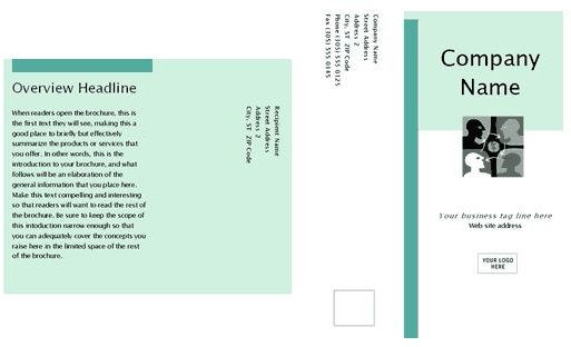
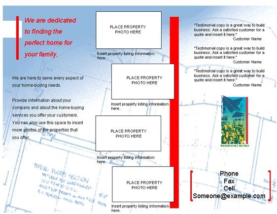
Creating Brochures with an Existing Template
If you choose to forego the downloading route, Microsoft Word 2003 has an existing template that you can use. Simply follow the instructions below to access and use that template:
- Select File > New.
- Under Templates, select On My Computer.
- Select the Publications tab.
- Click Brochure.
- Under create New, select the Document option.
- Click OK. A brochure template opens in Word.
- Replace the existing the existing content and save it.
- Turn on your printer and load it with the appropriate paper.
- Configure your printer to print the selected number of brochures.
Tips & Tricks
Color, Color, Color! If you are a small business owner, it is important to consider the color scheme of your brochure. Choosing the wrong colors can deter potential customers and leave them with a negative (and lasting) impression of your company. Here’s a guide to some of the most commonly used corporate colors.
- White: A pure, clean color suitable for technology or healthcare. Think of Apple or Crest.
- Black: A dark, seductive color suitable for luxury goods and the nightlife. Think of Johnny Walker or Louis Vuitton.
- Blue: A neutral, sedate color suitable for most corporations. Think of IBM or Royal Bank.
- Green: A healthy hue suitable for environmentally conscious companies. Think of Starbuck’s or a recycling logo.
- Red: A warm color suitable for the food and beverage industry. Think of McDonald’s or KFC.
- Yellow: A warm color also suited for the food and beverage industry. Think of Wendy’s or Subway.
- Orange: Another warm color that evokes happiness. Think of Clinique’s perfume, “Happy”, or ING Direct.
Photos**.** Unless you are using a professional, high-resolution camera, avoid using your own photographs. The results of do-it-yourself photography are often grainy and unfocused. Whenever possible, use royalty-free stock images instead.
Brevity. Keep it short and sweet. You do not want to overwhelm your customers with too much information. Just include a high-level overview. This encourages customers to contact you regarding specific inquiries and will make you and your employees appear more personable.
This post is part of the series: Working with Microsoft Word Templates
Learn how to downolad and edit Microsoft Word templates for brochures, greeting cards, certificates, journals, and flashcards.