What is a Histogram? Microsoft Excel’s Histogram Capabilities
What is a Histogram?
One of the most common tools used to study the frequency of numerical data is a histogram. Basically, a histogram is a bar graph that takes a set of data, breaks that data up into intervals, and then gives a graphical representation of how much of the data falls within each interval.
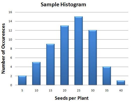
The figure to the left (click the image for a larger view) shows one example of a type of histogram that can be created in Microsoft Excel 2007. In this tutorial series, we’ll start from the very beginning, assuming that all you have is a raw set of data. From there, we’ll show how to define intervals and use the Frequency function in Excel to count how many items belong to each interval. Finally, we’ll use Excel’s chart capabilities to construct a histogram from this data.
A Working Example
Before getting started, we’ll give some background on the example we’ll be using. Let’s suppose we are harvesting seeds from a certain type of plant and recording how many seeds are obtained from each one. When finished, we’d like to create a graphical representation that summarizes our data, showing how likely it is to find a specific number of seeds in a plant.
A histogram is the perfect tool for displaying this type of information. A quick glance at the finished chart will give the viewer a rough idea of the minimum, maximum, and average values associated with this data collection. In a detailed statistical analysis, you’ll want to supply more concrete information in addition to the histogram, but the histogram itself is a great way to present a general overview of your initial data.
The Excel workbook containing the data and tables used in this series has been uploaded to the Windows Platform Media Gallery in a file named <strong>Microsoft Excel 2007 Histograms</strong>. You are welcome to download and use this file for your own personal purposes.
The Raw Data
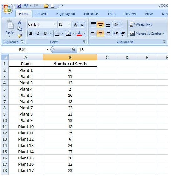
The first thing we need to do in preparation for creating a histogram is enter the raw data into Excel. In our example, we have information on the number of seeds harvested from 61 plants. We’ll input this data into a blank worksheet in Excel as shown in the following screenshot.
You don’t have to be too fancy here with formatting and layout unless you plan on including a table depicting your raw data along with your final analysis. However, if you are looking for some formatting tips, check out this series of Excel articles.
In the next article of this series, we’ll discuss how to organize this data using Excel’s frequency function.
This post is part of the series: Histograms in Microsoft Excel 2007
In this series, we’ll cover how to create a histogram in Microsoft Excel 2007. We’ll give some tips for entering your raw data into an Excel spreadsheet, show how to use the frequency function to organize your data, and then demonstrate how to construct and format the histogram from this data.